Political Typology Quiz: Understanding the Political Spectrum Beyond Left and Right
Every political typology quiz you have ever taken inherits its vocabulary from a furniture problem. In the late summer of 1789, France's National Assembly was arguing over whether the king should keep a veto, and the deputies did something that had nothing to do with ideology: they moved seats. Those who wanted to preserve royal authority gathered to the president's right. Those who wanted to break it gathered to the left. One of them, the Baron de Gauville, later wrote that the two sides simply could no longer stand being mixed in together.
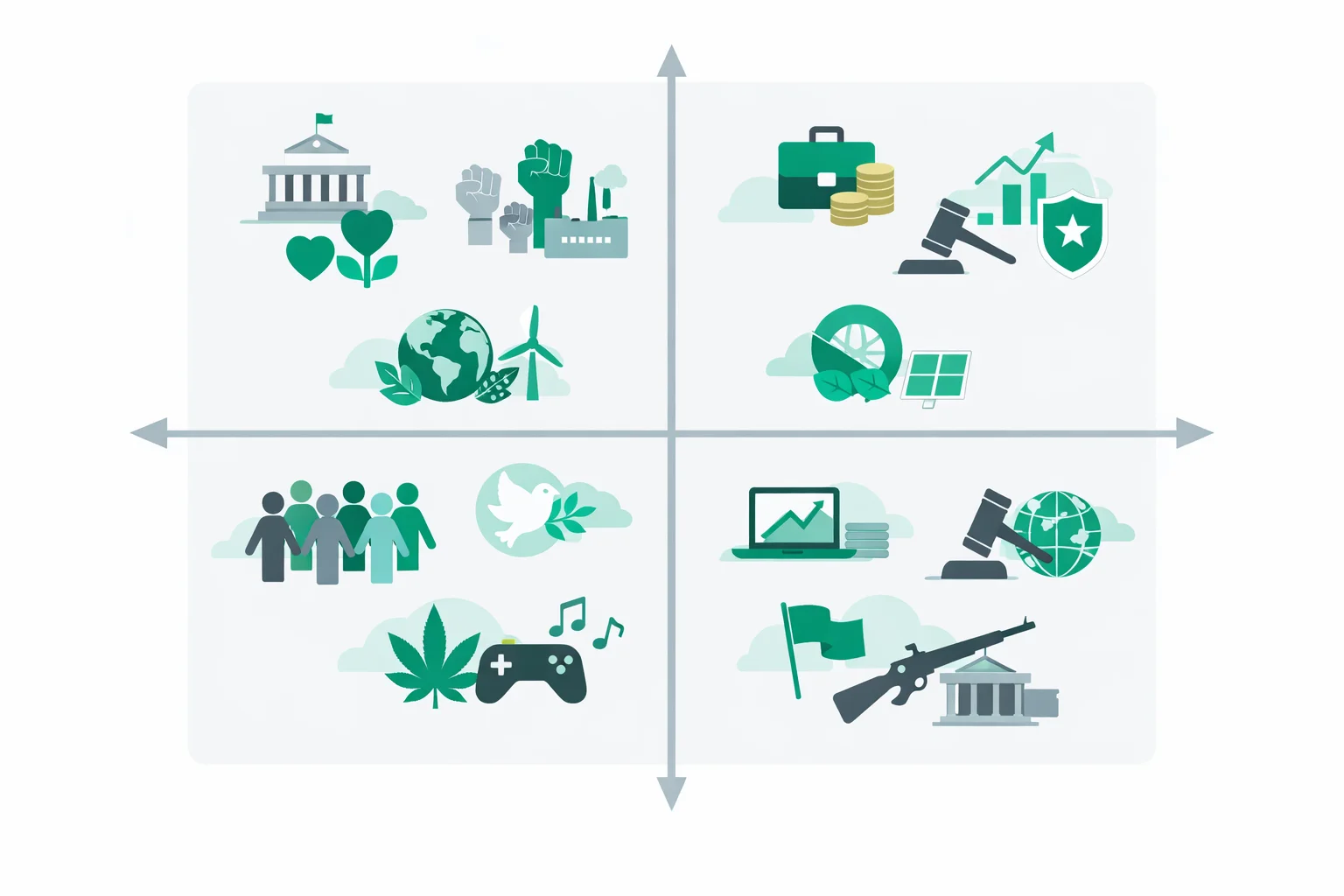
That was it. No theory, no manifesto — a room and a rule about where to sit. Two and a half centuries later we are still describing entire worldviews with a word that originally meant "over there, by the window." The quiz above exists because that single line has been visibly insufficient since roughly the 1930s, and it took another seventy years for the tools to catch up.
Left and Right Started as a Seating Chart in 1789
The seating habit outlived the Assembly that invented it. Under the Restoration after 1815, French newspapers were using la gauche and la droite as ordinary political nouns, and the convention spread outward through European parliaments that copied the semicircular chamber layout. English-language politics was slower — the terms only became common in Britain and the United States in the early twentieth century, which is why you will not find nineteenth-century American politicians calling each other left-wing.
What matters for a political spectrum quiz is what the metaphor smuggled in. A seating chart is one-dimensional by construction: you can be further left or further right, and that is the entire range of things you can be. For a chamber arguing about one question — how much royal power survives — that was a perfectly good model. It stopped being one the moment politics started asking several unrelated questions at once. The history of the left-right spectrum is largely the history of people noticing that and trying to patch it.
The Century That Broke the Single Line
Here is the puzzle that eventually forced a redesign. By the late 1930s, Europe contained two regimes that agreed on almost nothing economically and behaved almost identically toward their own citizens: secret police, censored press, mass mobilisation, no meaningful right of dissent. On a single left-right line they sat at opposite ends. In lived experience, a dissident in either country faced the same knock on the door.
A one-dimensional spectrum has no way to express that. It can tell you two governments are far apart on economics; it cannot tell you they are neighbours on the question of how much power the state may take over a person. Researchers kept running into the same wall from the other direction too: survey respondents who wanted nationalised industry and strict policing, or free markets and drug legalisation, kept landing in the middle of the line as if they held no strong views at all. They held two, and the instrument was averaging them into nothing.
Why Did Political Tests End Up With Two Axes?
The fix came out of psychology rather than political theory. In The Psychology of Politics (1954), Hans Eysenck factor-analysed attitude surveys and reported that political opinion needed at least two independent dimensions to describe it: a radicalism-conservatism factor that looked roughly like left-right, and a second factor he called tough-mindedness versus tender-mindedness, which cut across it. The second axis was contested from the start — critics argued Eysenck had built it out of items that flattered his own conclusions — but the core claim held up. Later factor analyses of political attitudes keep recovering an economic dimension and a separate social one.
The grid you just used descends from a more practical branch of the same idea. In 1969 the American activist David Nolan sketched a chart with economic freedom on one axis and personal freedom on the other, specifically to make visible a position the single line had erased. That chart became the basis of the World's Smallest Political Quiz in 1987, and the Political Compass website adapted the two-axis presentation for the web in 2001. Most political compass quizzes online today are descendants of one of those three.
The three-band split we use — left, centre and right on each axis, giving nine cells rather than four quadrants — exists because quadrants are too coarse to be interesting. A dot at (-0.4, -0.3) and a dot at (-9.1, -8.8) share a quadrant and share nothing else. Nine cells separate "leans that way" from "lives there."
Pew Threw Out the Spectrum Entirely
While quiz sites were refining the grid, the most rigorous work in this area went in a different direction and abandoned geometry altogether. The Pew Research Center has published its Political Typology roughly every four years since 1987. Rather than placing people on axes chosen in advance, Pew runs cluster analysis on attitude data and lets the groupings fall out of the responses. The 2021 edition, "Beyond Red vs. Blue", sorted a survey of more than 10,000 American adults into nine groups with names like Faith and Flag Conservatives, Progressive Left, Ambivalent Right and Stressed Sideliners.
Two findings from that work are worth carrying into your own result. First, the groups do not line up neatly along one line — several are internally split on major issues and vote for a party they disagree with on some of them. Second, Pew's largest single group in 2021 was Stressed Sideliners, the least politically engaged cluster in the sample. The biggest bloc in a typology of political opinion turned out to be people whose defining trait is not having a settled one. Any quiz that hands out nine confident labels should say that out loud.
Our nine cells are not Pew's nine groups, and the difference is deliberate. Pew measures Americans as they actually cluster, so its categories carry American party history inside them. A grid built from principles instead of clusters travels better — it gives the same reading whether you are in Ohio or Osaka — at the cost of telling you less about how your neighbours vote.
Here's the Trick Most Free Political Quizzes Skip
Survey methodologists have known since Lee Cronbach's work on response sets in 1946 that people tend to agree with statements put in front of them, more or less regardless of content. It is called acquiescence bias, and it is brutal for agree/disagree instruments. If a quiz phrases every economic statement in the pro-market direction, an agreeable respondent drifts right for reasons that have nothing to do with economics.
The standard remedy is reverse coding, and this quiz applies it symmetrically — down to the weights, not just the counts. Five statements lean toward markets and five toward collective provision; five lean toward order and five toward liberty; the immigration item carries a small economic side-weight to keep the columns square. Added up, the two directions are identical: 43 points either way on the economic axis, 41 either way on the authority axis. The practical consequence is testable: answer "strongly agree" to all twenty statements and you land at exactly (0, 0), the dead centre of the grid. Do the same on a quiz without reverse coding and you will be shoved into a corner you never chose.
This is also why the quiz never names a party, a politician or a country. Attitude items that mention a real party stop measuring the attitude and start measuring how you feel about the party — a problem political scientists call partisan cue-taking, and a big part of why a political ideology quiz built from party labels tends to just hand people back the label they walked in with. Keeping the items abstract has a second benefit: the statements do not expire. A question about emergency powers reads the same in 2026 as it would have in 1976, which is not true of anything tied to a current government — as the shifting alliances in our history quiz make fairly obvious.
What Your Quadrant Does and Doesn't Predict
Your coordinates describe attitudes at one moment. They do not predict your vote, and the gap is not a flaw in the quiz — it is the actual structure of party politics. Parties bundle economic and social positions together for historical reasons, and the bundles on offer in any given country cover maybe three of the nine cells. If you landed in Communal Traditionalist or Civil Libertarian territory, there is a good chance no major party matches both halves of you, which is precisely why those cells feel homeless.
Two more limits are worth stating. The axes have no units, so your -6.2 and someone else's -6.2 from a different site are not the same measurement — the number is only meaningful relative to the other people who took the same instrument. And the popular horseshoe idea, that the far ends of the spectrum curve toward each other, is a contested claim usually credited to the French philosopher Jean-Pierre Faye, not a settled finding. What the two-axis view actually shows is subtler: the far ends converge on the authority axis and stay far apart on the economic one, which is exactly the 1930s puzzle that made the second axis necessary in the first place.
One thing your result does predict reasonably well is which factual claims you will accept without checking. Motivated reasoning runs strongest where the grid runs strongest, so the honest companion to this quiz is a weekly news quiz — it separates people who follow events from people who follow commentary about events.
All 9 Political Typology Results Explained
🌻 The Liberation Progressive (economic left, liberty) wants an active state in the economy and an absent one in private life. Wealth concentration looks like a design flaw; questions about speech, drugs and personal choice look like nobody else's business. The bind is structural — the large state that redistributes is the same institution asked to stay out of the bedroom.
🤝 The Social Democrat (economic left, balanced) treats markets as a good engine and a poor steering wheel. Tax the output, guarantee the floor, judge social questions on whether the policy works. It is one of the two most crowded cells and the closest thing to a governing consensus in postwar Western Europe.
⚒️ The Communal Traditionalist (economic left, order) holds that the community owes the individual security and the individual owes the community loyalty. This is the oldest surviving position on the left and the worst served by modern parties, which usually force a choice between its economics and its values.
🕊️ The Civil Libertarian (economic centre, liberty) is not economically undecided so much as economically uninterested. State power over the person is the live issue: surveillance, sentencing, due process, speech. The reliable tell is defending a procedural right for someone whose politics they find repellent.
⚖️ The Pragmatic Moderate (centre, balanced) is the single most common and most misread result. Genuine moderates hold several strong positions that cancel out — pro-market on trade, pro-regulation on banking. Disengagement looks different: neutral answers with low intensity everywhere. The axis bars tell you which you are.
🏛️ The Institutional Centrist (centre, order) is relaxed about ownership and unrelaxed about whether the rules hold. Continuity, competent administration and public safety outrank the left-right argument, and sweeping change from either direction reads as risk rather than progress.
🗽 The Market Libertarian (economic right, liberty) applies one principle symmetrically: the state is the last resort, in commerce and in private life alike. Plenty of people want one kind of freedom; comparatively few want both without carve-outs. This is the exact position the Nolan chart was drawn to make visible in 1969.
📈 The Classical Liberal (economic right, balanced) trusts prices and competition over committees, without purism — regulation is acceptable where markets visibly fail. Growth is the thing being protected, on the argument that most other problems are easier to solve in an expanding economy.
🛡️ The Traditional Conservative (economic right, order) pairs free enterprise with settled values, the most electorally successful combination in the democratic world. Inherited institutions read as accumulated knowledge, and change should prove itself before adoption rather than after.
What to Do With a Dot on a Grid
Look at the answer the quiz flagged as breaking your pattern. That single item is more informative than the label above it, because it marks where one of your principles stopped being convenient — and positions people hold when they are inconvenient are the ones they actually defend under pressure. Everything else in your result is a summary of things you already believed on the way in.
Then go find the strongest version of the argument against your own cell, not the weakest. The cheap version of political self-knowledge is collecting a label and wearing it. The useful version is knowing exactly which two or three answers would have to change to move your dot, and being honest about what evidence would change them — a habit that starts with knowing how much you actually know, which our general knowledge quiz is uncomfortably good at revealing. That question is answerable. Your coordinates, in the end, are just the seating chart from 1789 with a second dimension bolted on.